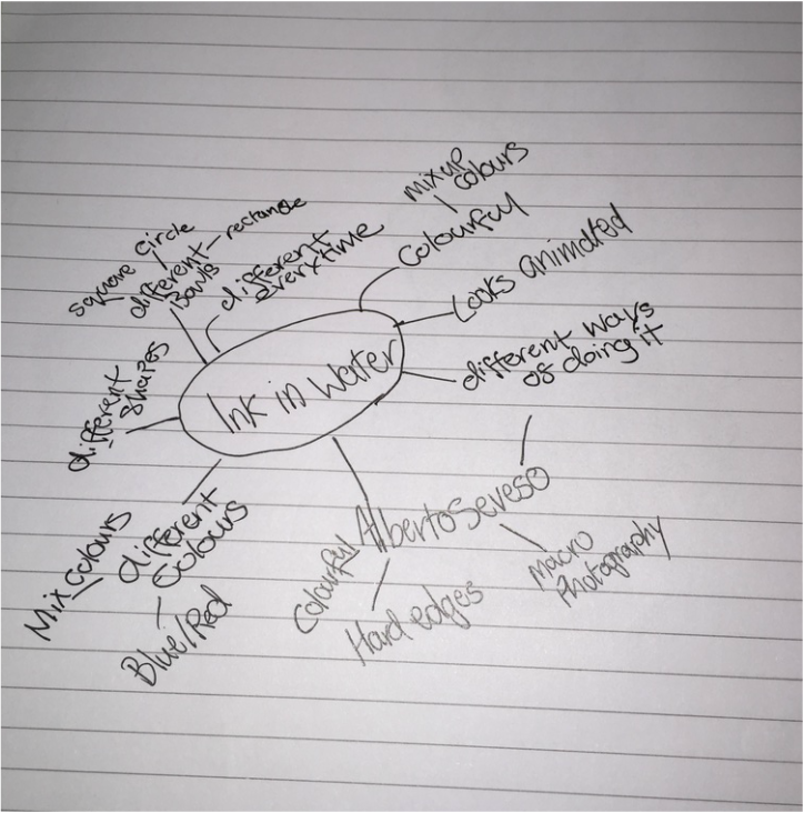
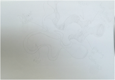
Brainstorm/Draft Sketch
|
|
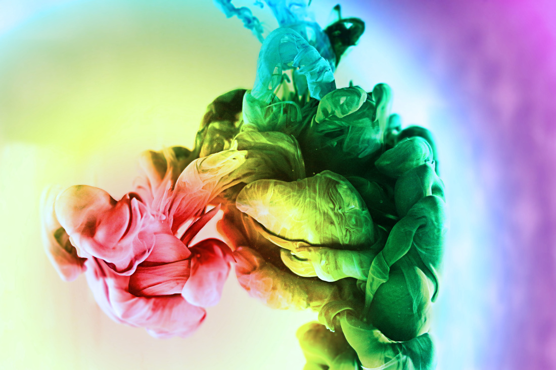
Alberto Seveso

Alberto Seveso is a Italian illustrator and digital photographer and most of his work uses a lot of photoshop and his ink photography shows more than one colour and Alberto Seveso also does pictures that have a models face and then has been heavily photoshoped with a lot of different colours and shapes and sizes.
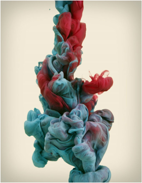
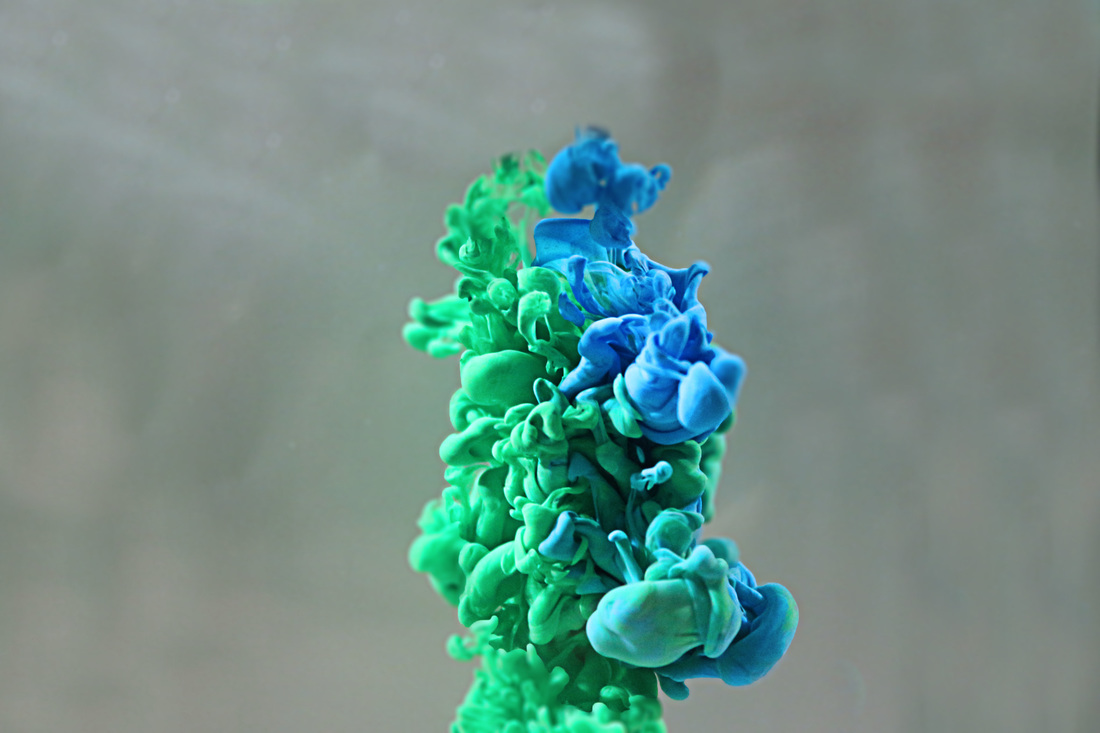
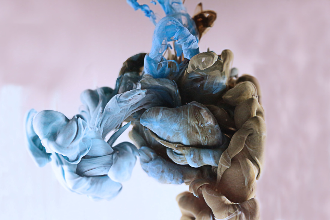
I really like this photo because of the way Alberto Seveso has mixed two different colours together and how they don't mix together to make a new colour but are together as they are in the water. I like the background of this image because it is not plain background and it is not bright enough to take away the attention of the ink in the water.
|
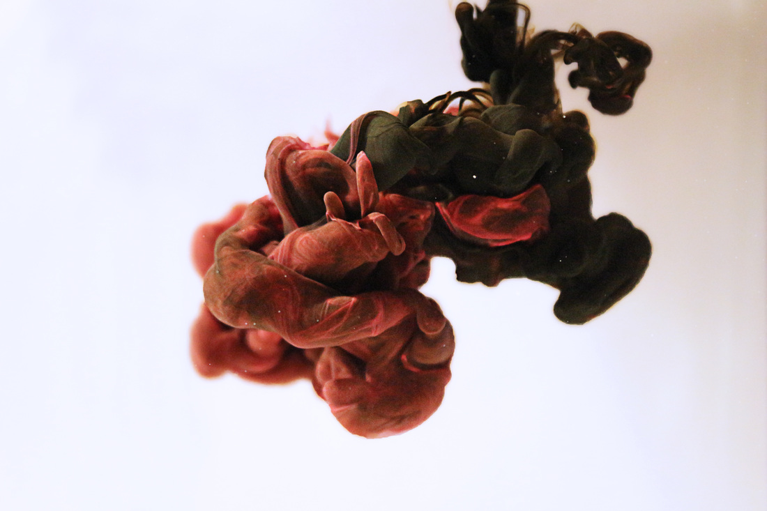
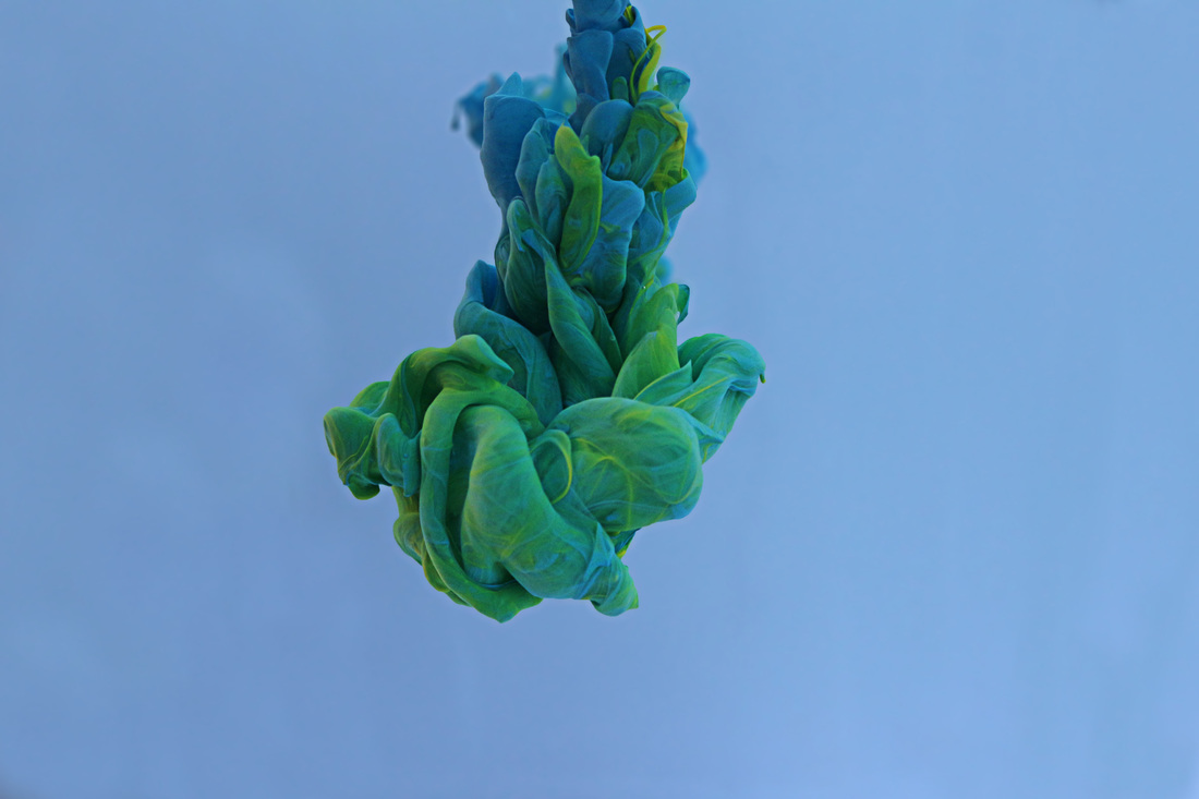
I like this photo because of the way Alberto Seveso has mix two colours together and how as they have been in the water they have mixed and made a new colour and how the ink is now connected with the top and are separate also how the background has a tint of orange in it with a white out line.
|

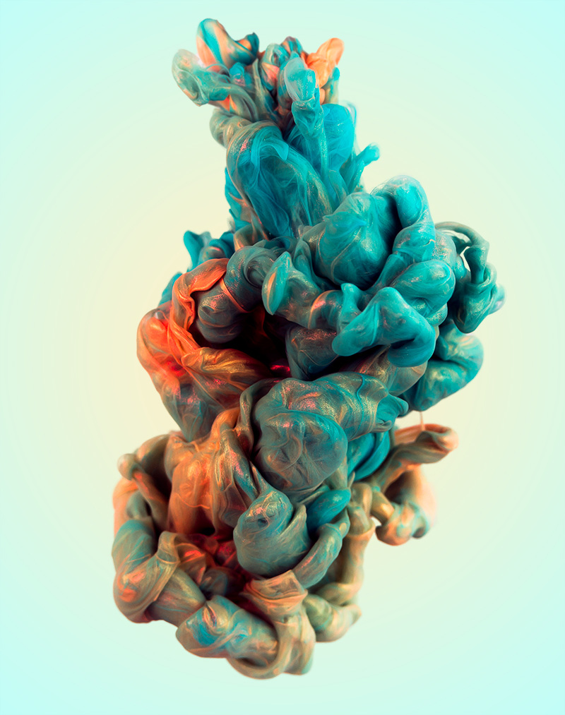
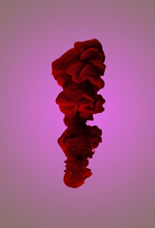
I like this image because you are able to see all the detail in the ink when it enters the water and how the background of the image is white so all the focus of the viewer is looking at the ink i also like how the ink is all one colour and how you get to see from the left you can see how the ink when it first enters the water and on the right you are able to see how the ink spreads out and the circles in the ink get bigger and how the shapes are all different from each other.
Photoshot 1
This photoshoot wasn't a really good one but it the first one and what i did good in this photoshoot was that the ink is in focus and that some of the lighting is good but from one side that the light is blocked off by the hand that is putting in the ink to the water but was is good is that most of the pictures taken are in focus.
4 Strongest Images


Photoshoot 2
This photoshoot wasn't going good at first but as i kept on doing it again and again the shapes of the ink got better and i was able to manual focus quicker as the ink entered the water but i kept on trying to use black and red ink because i could see that it would look nice when it mixed together and the edited photo came out good when edited. I used two syringes to get the two coluors in at the same time
4 Strongest Images


This edited image i think i really good because i was able to blur part of the ink so that it looks like some part of the ink is coming out and there is also white dots in the ink that make it look like there is glitter in side the ink. Also the background of the image is white on the left and on the right it has bit of black in the corner so it looks like the black fades out.
Photoshoot 3
With this photoshoot i used warm water instead of using cold water to see what reaction i would get with putting the ink in to the water and what i noticed was that the ink doesn't stay together for long before they start to spread out and the shapes that the inks make are different compared with using cold water.
This edited photo is a good one because of i was able to practice and use the clone stamp tool and use the paint brush to get rid of the ink that was at the top and I got rid of the top so that i could make the image look like that it is floating in the middle of the water and i was able to blur some parts of the image so it looks like some parts of the image is popping out and to make the viewer look at certain parts of the image.
Photoshoot 4
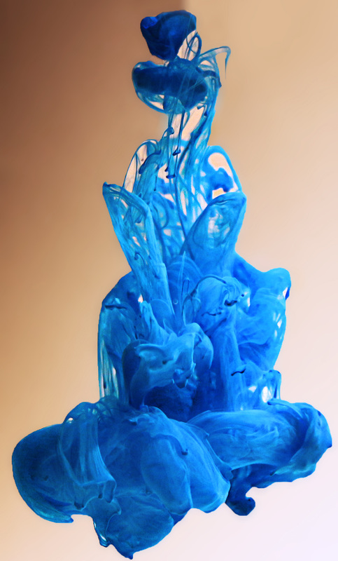
I think that this photo shoot went really well because i was able to mix two colours together and how i did this is that i put two lamps one on the left side and one on the right side and what i did was that i got two syringes one filled with red and one filled with blue and i had to put them in both at the same time so that the two colours could mix together and if i was to put on colour in before the other there wouldn't be a big blob of ink mixing in the middle.
I think that this image is one of the best edited images because of the two inks merging together and how i was able to make the image pop with blurring part of the image so that some of the image looks like it is coming out and how the background of the image is part of two colours and the background doesn't take anything away from the inks that are in the middle.
Photoshoot 5
With this photoshoot i placed the lights in a different position to see how the colours would look when they enter the water and what i noticed was that the inks were dark at first and as the inks got closer to the glass the inks got brighter and more in focus and the colours mixed together.
I like this edited image because unlike all the other images the ink is not all together and the inks are all spread out and with using photoshop i was able to get rid of the glass that was in the way by using the clone stamp tool.
Photoshoot 6
For this photoshoot I used a round fish bowl and used a stick to spin the water in side and then put the ink in the water to see what the effect was and i think that this photoshoot wasnt good because you are not able to see any shape of the ink in the water and the shape of the ink stayed the same most of the time the ink was in the water.
Photoshoot 7
In this photoshoot i tried to use more than just two inks in the water and i tried use three inks at the same time but what was hard about this is that i had two different people put the ink in the water and the timing of putting them in at the same time was hard to do and i think that the colours that i used for this wasnt the best of colours to use and also for this photoshoot i used natural light that was coming out the glass door i was doing this photoshoot.
Photoshoot 8
For this photoshoot i was using four inks to see how it was coming out and what was hard about this photoshoot was the timing of putting in the ink into the water. But what went well in this photoshoot was that i was able to get some images in focus while it was going into the water and the shape that came out and how the colours mix with each other was good as well.
Photoshoot 9
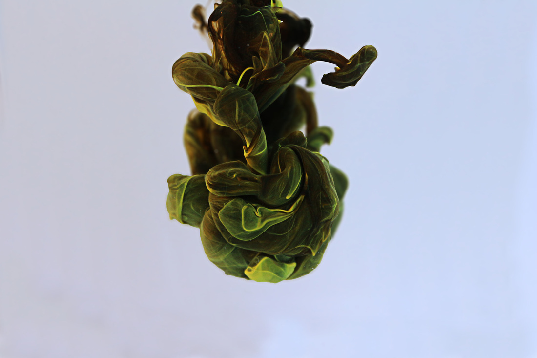
This photoshoot turned out to be a good photoshoot because when I put the two colours inside the water the colours mixed together to make green and also what i did different in this photoshoot was that instead of using a piece of A4 paper and stick it up what i did was use a big white piece of cardboard so that there was on creases in the paper and that when editing the photo to change the colour of the background was easy to do and also i did the whole process of taking the pictures outside and what i think that helped with making the shapes was that it was really cold and I used cold water and the ink would go down the water slower that usually and it gave me more time to focus the camera and take a picture.
This edited photo is a good one because of the shape the two inks made and at the top you are still able to see the yellow and as the ink comes down it makes it green and you hardly see the blue and yellow. I also used "High Pass" so that the image is more sharp and that inside the ink you are still able to see some of the images and how it is still mixing inside.
Photoshoot 10
I think that this photoshoot turned out good because of how the yellow ink mixed with the black and the black ink didnt take fully control over the yellow ink. Also the shape of the ink was really good and the ink didnt split as it carried on going down the water and I also took this photoshoot outside where it was cold and the water was also cold so that the ink was flowing down the water slowly and helped me focus the camera and take the picture.
Photoshoot 11
This photoshoot was good because of how the green ink overcame the black ink and how the two mixed together and the shape it made was also good because of the two inks weren't separated the green ink made grooves in the back ink this photoshoot was also taken outside where it was cold and i also used cold water.
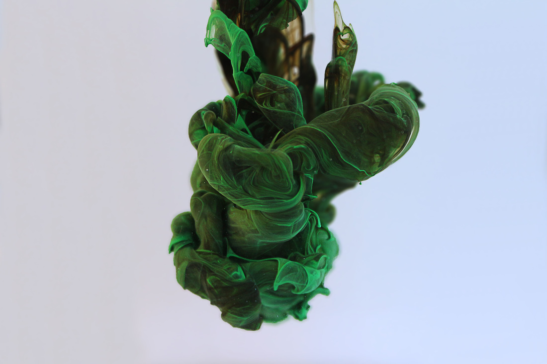
This edited image is good because I was able to use the "High Pass" effect to make the image more sharp so that the viewer is able to see the green inside the black and so that the viewer is able to see that the green isnt one big blob and that there is a lot of green lines inside the black and I was able to use the clone tool so that I could get rid of the background so that there is only a white background and so that there isnt a table and so that the glass is not in the way so it looks like the ink is floating in the middle with nothing around it.
Testing
|
|